Primovilla
Task
Create a modern, bold and fresh look for an open-minded real estate agency.
Based on respect and modern visions, PrimoVilla is an innovative family business and believes in sustainable real estate developments. Using the latest technologies in the smart home industry, they create opportunities for young families for a safe and comfortable home. Like the name states, they target young adults who dream about their “primo” (first) home.


Main colors

Tints

The color palette of the brand identity captures the spirit of innovation and optimism that defines the brand. With its bold, vibrant hues and unique blend of blue and yellow, the palette evokes a sense of energy and excitement, reflecting the dynamic and forward-thinking nature of the young team.

Fonts play an important role in the general tone and quality of Primovillas messages, they strengthen the personality and ensure clarity and harmony in all communications. Museo Sans helps to express energy and enthusiasm throughout the brand’s communication. It has a bold, geometric, and very readable appearance. It offers support for Romanian and is very suitable for any display and text.
In addition, Museo Sans can be combined with an isometric or 3d font to achieve depth & playfulness in promotional materials.

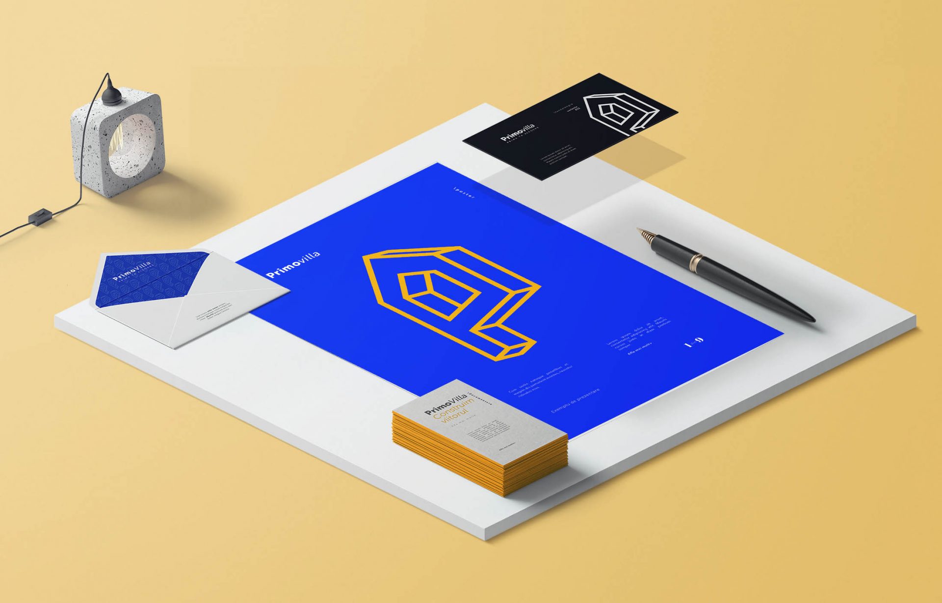
Primovilla reflects a new approach, a bold and brave attitude throughout all promotional materials. Everything is lined up with the brand’s core values and philosophy.


Brave ideas need to shout, overcome challenges, and fight for strong beliefs! It’s great that you are committed, and so are we. Always. Let’s meet and start a new adventure.