Blokx
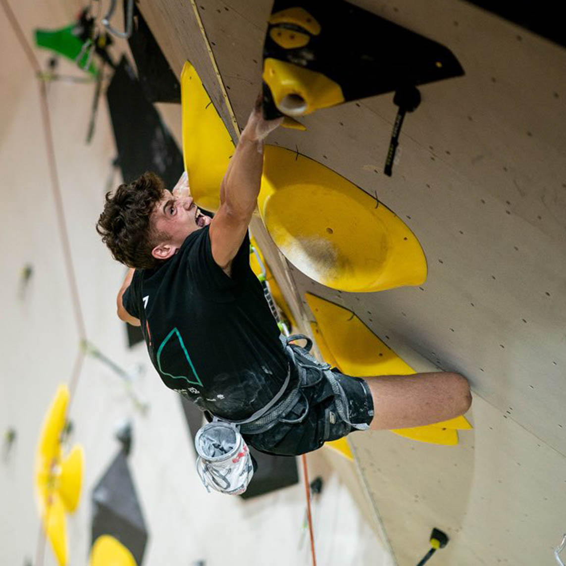
Blokx is an adventurous and fun brand with climbing gyms around Romania. Their aim is to bring climbing closer to ordinary people, and build a community of healthy and happy individuals, who can share their passion for climbing in a safe and authentic environment.


When we crossed paths with Blokx, they were already a few years into their journey, driven by a highly motivated team and an enthusiastic clientele. Their friendship and shared love for the sport had been the glue that held Blokx together, enabling it to operate with minimal advertising and a somewhat spontaneous visual approach. However, as Blokx sought to expand its horizons and open new gyms in different locations, they realized the need for a more cohesive and defined visual identity. This realization marked the start of our collaboration and the beginning of Blokx’s visual evolution.
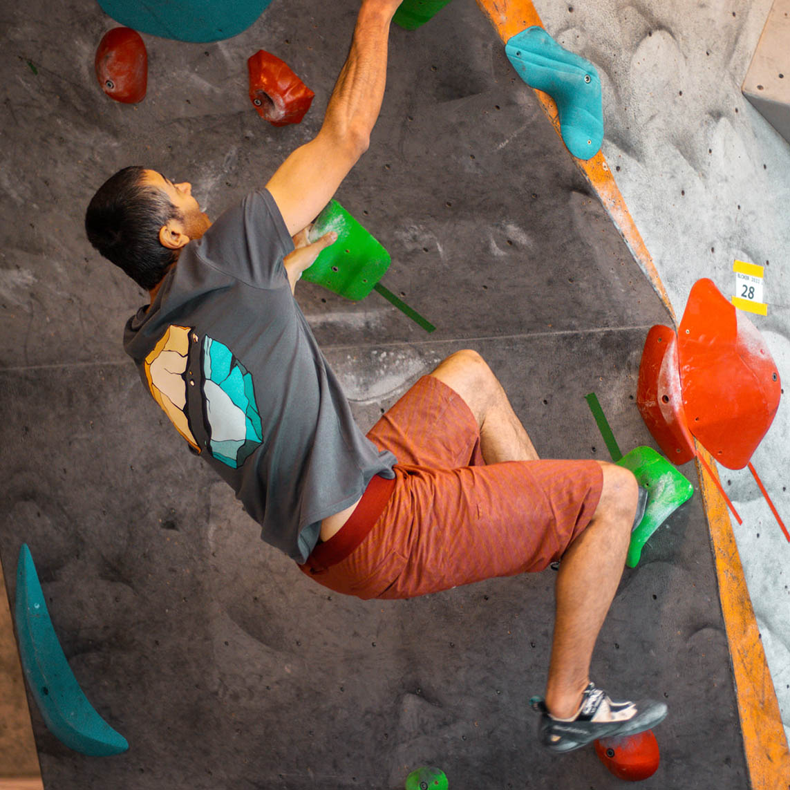
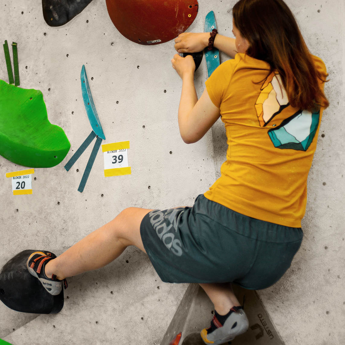
As we engaged in discussions and meetings, we began to uncover the essence of the Blokx brand — an important moment in our partnership. Blokx isn’t your typical competitive hero brand; It’s a brand that resonates deeply with its creators, reflecting the time, effort, and heart they poured into it. Blokx makes you laugh, supports your growth, and helps you master your skills. It’s a community founded on friendship, mutual support, fun, relaxation, and exercise. It’s all about fostering connections and creating an environment where everyone can flourish, both personally and physically.


| #e96a24 |
◯ |
|
| R 233 G 106 B 36 |
Orange
| #009D90 |
◯ |
|
| R 0 G 157 B 144 |
Cyan
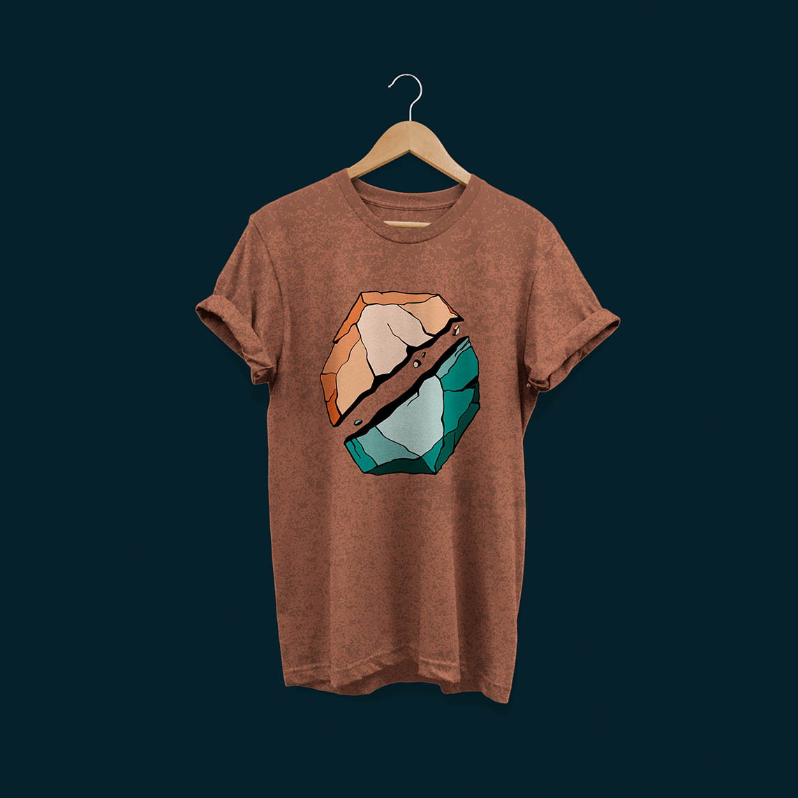
At the heart of the brand’s look and feel are two lively colors – Orange and Cyan. Think of Orange as the vibrant, high-energy friend, while Cyan is the cool, innovative buddy. Together, they’re the dynamic duo that sets the tone for Blokx, making it all about exciting adventures and fresh ideas.
| #5F290E |
◯ |
|
| R 95 G 41 B 14 |
Brown
| #003838 |
◯ |
|
| R 0 G 56 B 56 |
Forest green
| #F9E2D2 |
◯ |
|
| R 249 G 226 B 210 |
Cream
| #DEE9E6 |
◯ |
|
| R 222 G 233 B 230 |
Light blue
To add a bit of flair, we use 2 lighter tints and 2 darker shades. These aren’t just any colors; they’re like the secret ingredients that make the palette work, the visuals stand out, and make sure everything looks sleek and clear.
With this color palette, we create visuals that not only catch your eye but there are always ways to experiment and have fun.
Typeface
Basier Circle & Mono
Usage
We aim for simplicity, well-defined lines, balanced proportions, effortless readability, and a clear hierarchy. The body text is legible and easy on the eyes with Circle Regular. For titles Circle Mono Bold is used, and for subtitles Circle Mono Regular.


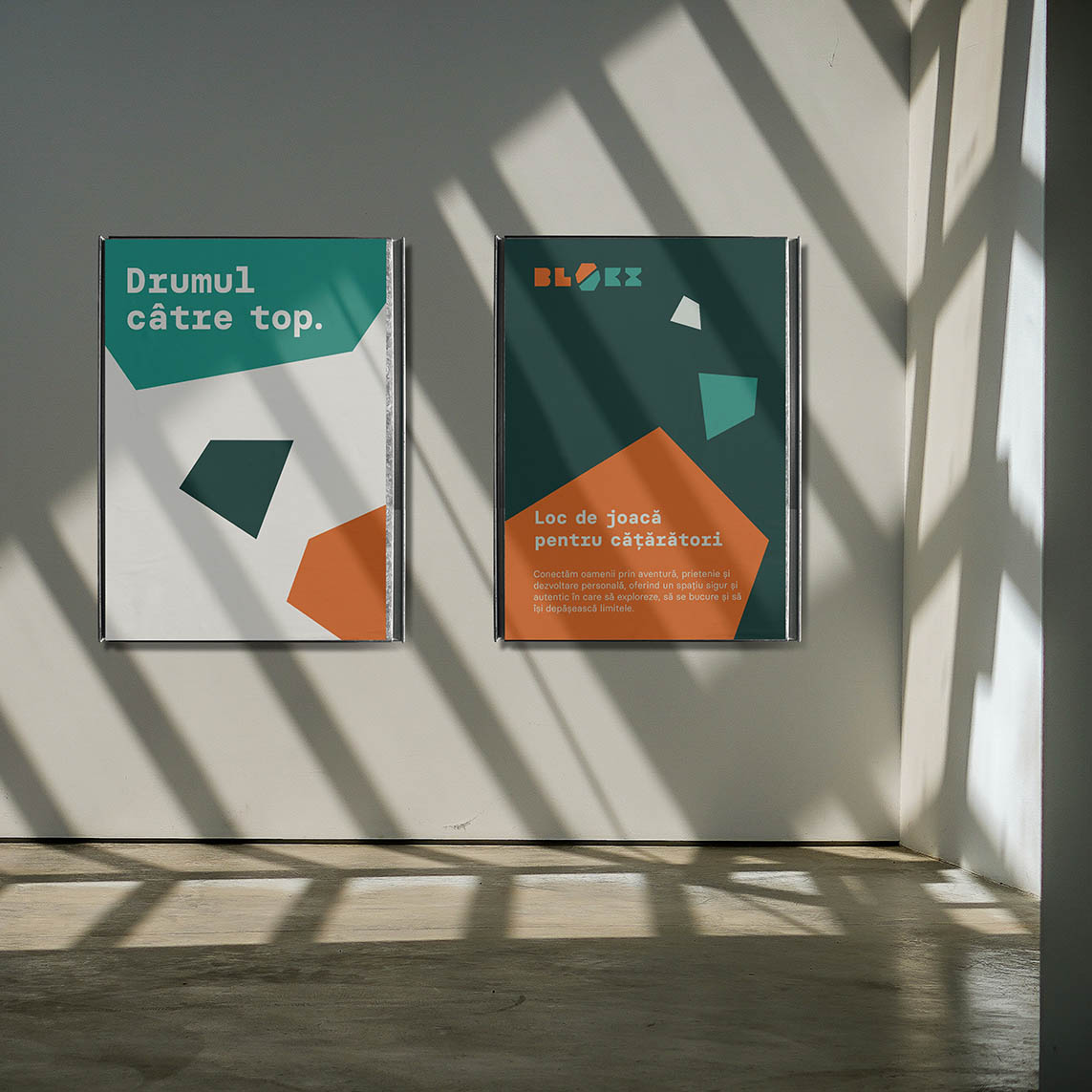
Creating the Blokx Mures website, we wanted to present their friendly tone and approach. The design is refreshingly straightforward, with clear messages and minimalist visuals that align with the brand’s colors, fonts, shapes, photos, web elements, and key messages.
The social media image also needed refinements. We crafted an icon set and a collection of personalized templates for their Instagram feed. These templates make it easy for them to share daily updates, announcements, news, and more, while maintaining a consistent and engaging online presence.


Are you into sports? Us too! If you’ve got an amazing idea that revolves around this passion, we’re all ears.
Share your thoughts with us, and let’s see how we can bring your brand vision to life.