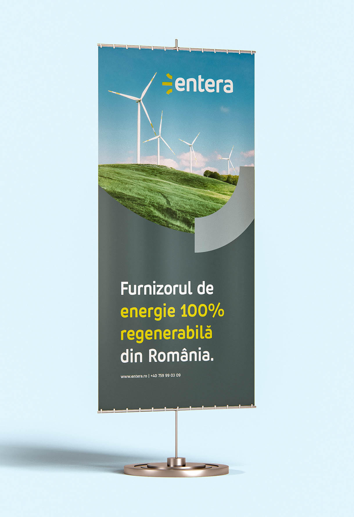
There is no better time than now to build a green future. Entera assumed the role of the partner of those who believe in a sustainable life, fueled by renewable energy. Entera is building a world where innovative technologies and natural resources mean smart solutions for a better life. Entera produces and provides certified green energy in a transparent package for any company in Romania that wants a sustainable organization and to contribute to a change for the better in the environment.
We are a team of creatives who are excited about unique ideas and help companies start their business journey. Being part of the evolution process from the very first drafts, we learned a lot about green energy, its benefits, and understood our client’s needs and visions. We helped the Entera team to come up with a suitable brand name, find their voice, express their messages both visually and verbally, and guided the transformation of a great concept into reality.


MW Eolian power
MW Solar power

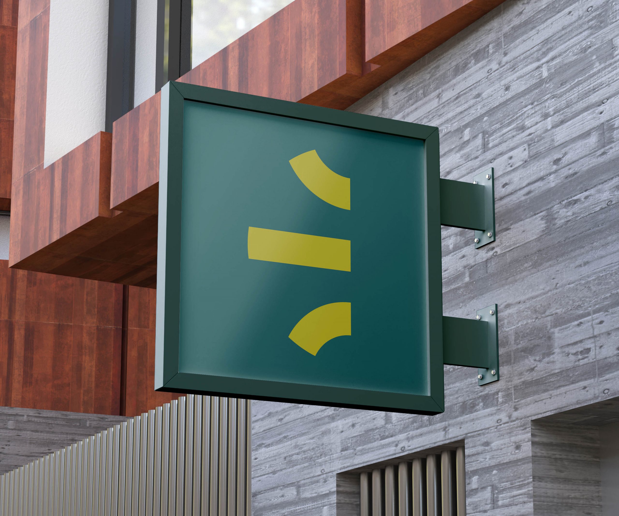
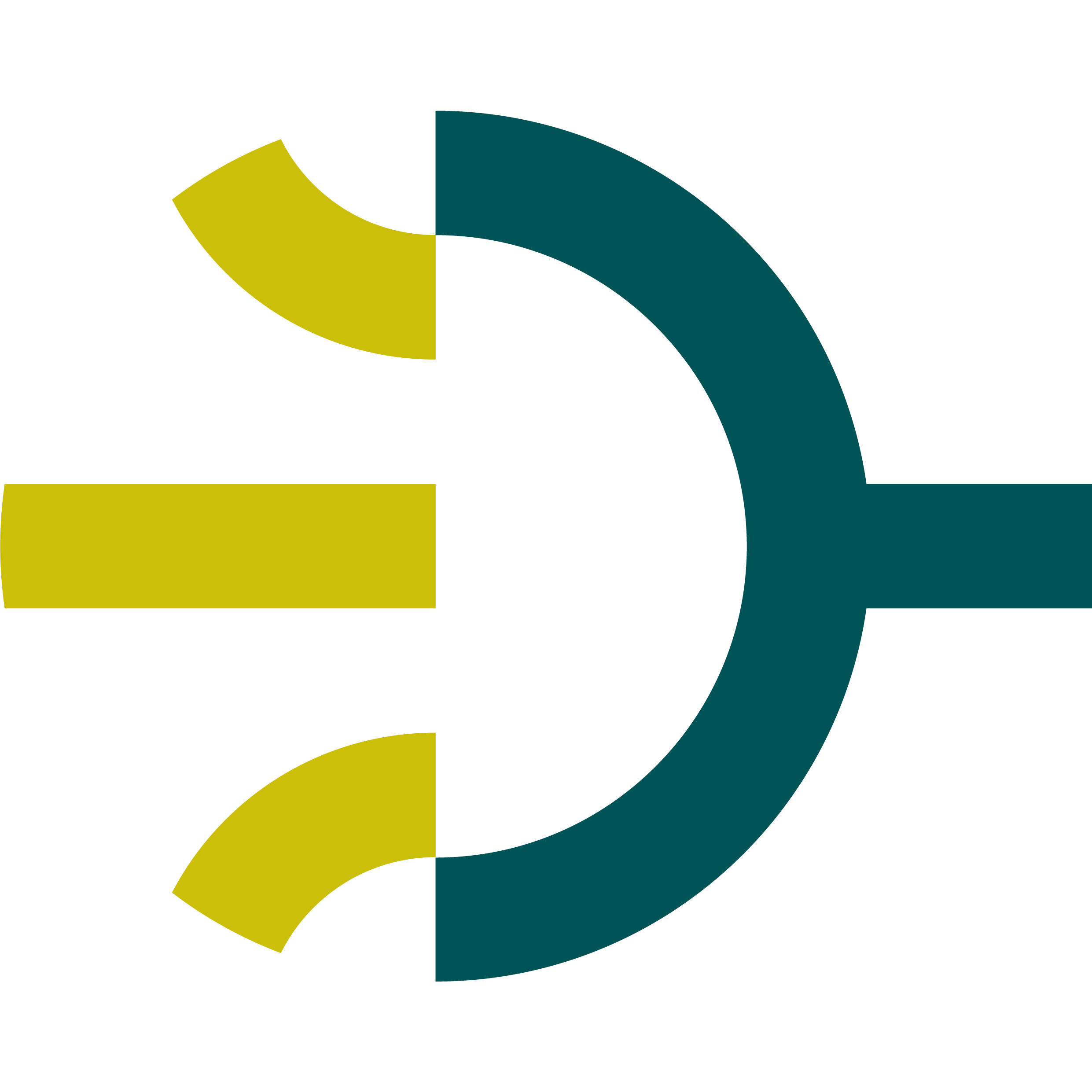
Logo
The symbol is inspired by the three syllables of the word en-te-ra, and consists of an abstraction of the letter “e”. Converging lines symbolize the merging of resources of renewable energy – sun, wind, and water.
Naming
Naming // The word entera integrates the concept of “enter” and “terra” which also represents the hero archetype and natural approach of the company.
Main colors

Green is the main brand color, symbolizing energy from natural sources. It must be used most often to obtain a consistent brand image in all communication materials. Forming a strong contrast with green, the color yellow has the role of highlighting important elements such as buttons on the website, words, or important phrases.
Neutral colors

Accent colors


Font family
Entera uses the Pusia font-family: It is a professional, contemporary sans serif family, with friendly and dynamic shapes. Its subtly curved shapes and attention to detail reflect the character of the brand.
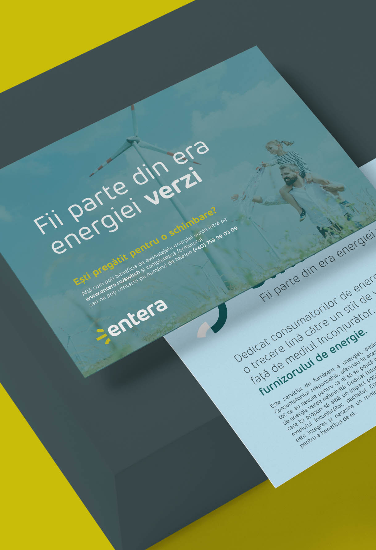
Throughout their website and branding, Entera encourages society to make a change and join the green energy revolution. Beside a dynamic layout, we integrated online payment and subscription methods for Entera’s clients.


Custom-made icons for services & energy resources.
The symbols are configured from the grid of the Entera logo.

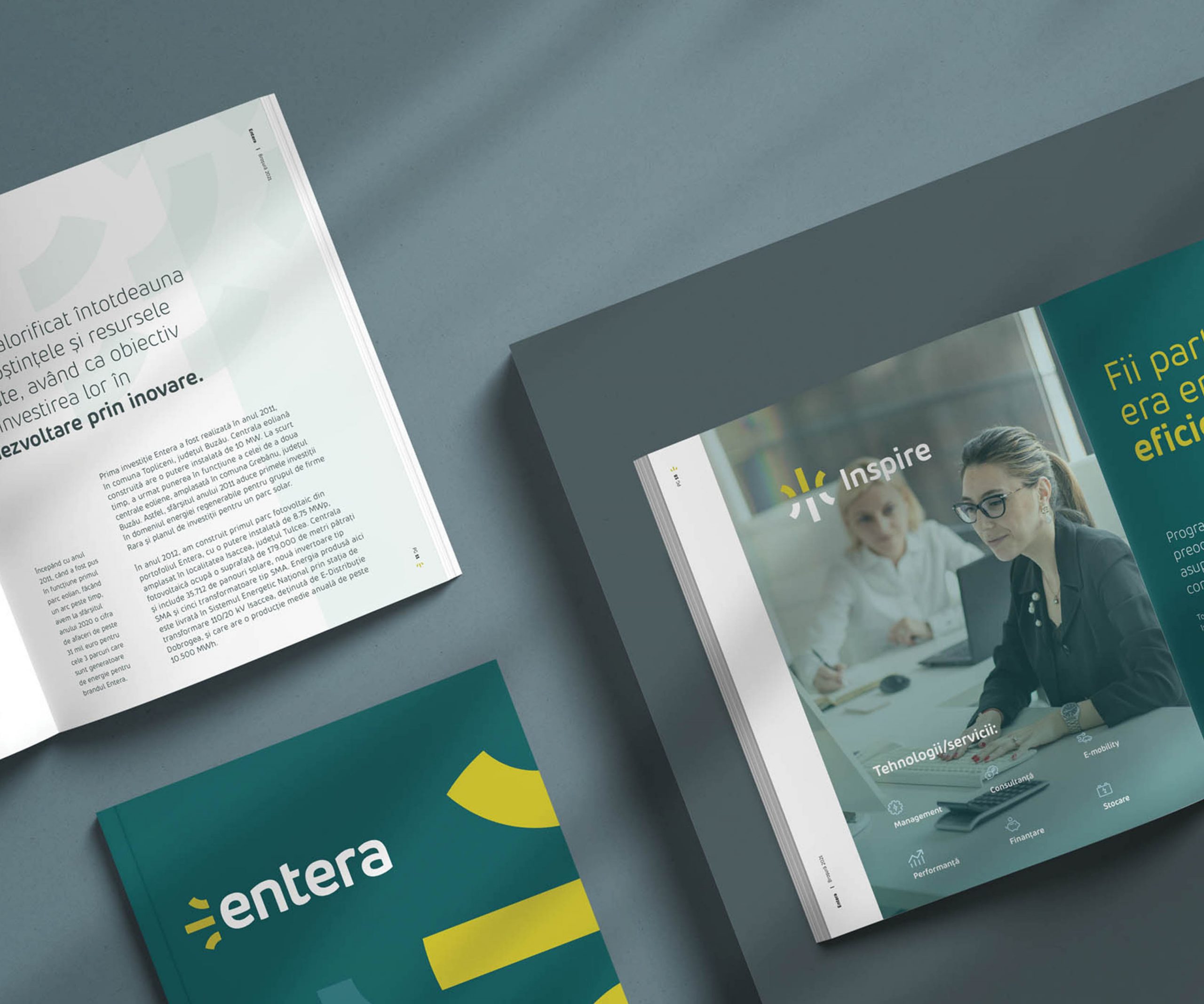
Inspire
For companies interested in consumption, environmental impact, and employees.

Share
An integrated system of production and self-consumption of green energy.

Smart
The Smart package was created for consumers who appreciate smart solutions.
Switch
Dedicated to consumers who want to make a transition to a responsible lifestyle.

Solar energy
Solar power is energy from the sun that is converted into thermal or electrical energy.

Wind energy
Wind turbines convert the kinetic energy in the wind into mechanical power.

Hydro energy
Hydroelectric energy is a form of energy that harnesses the power of water in motion.
The icons are created using elements from the logo symbol.