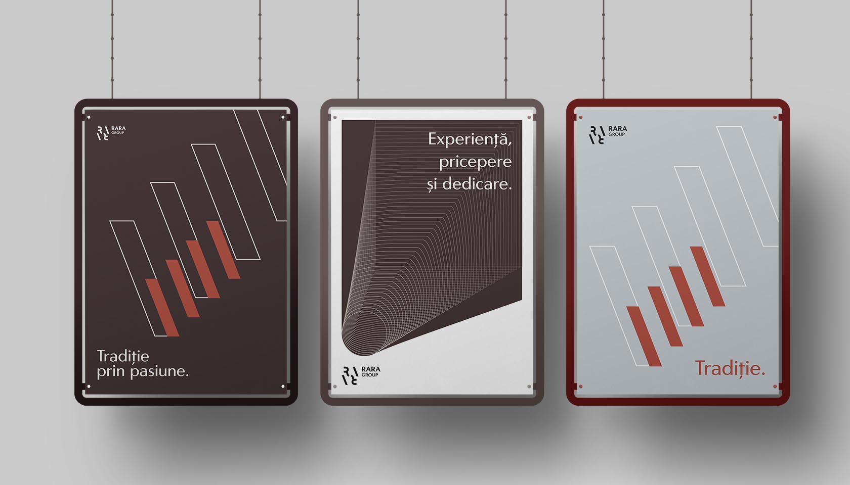
Rara
Task
Rebranding for Rara, a prestigious group of companies from Brașov city, Romania.

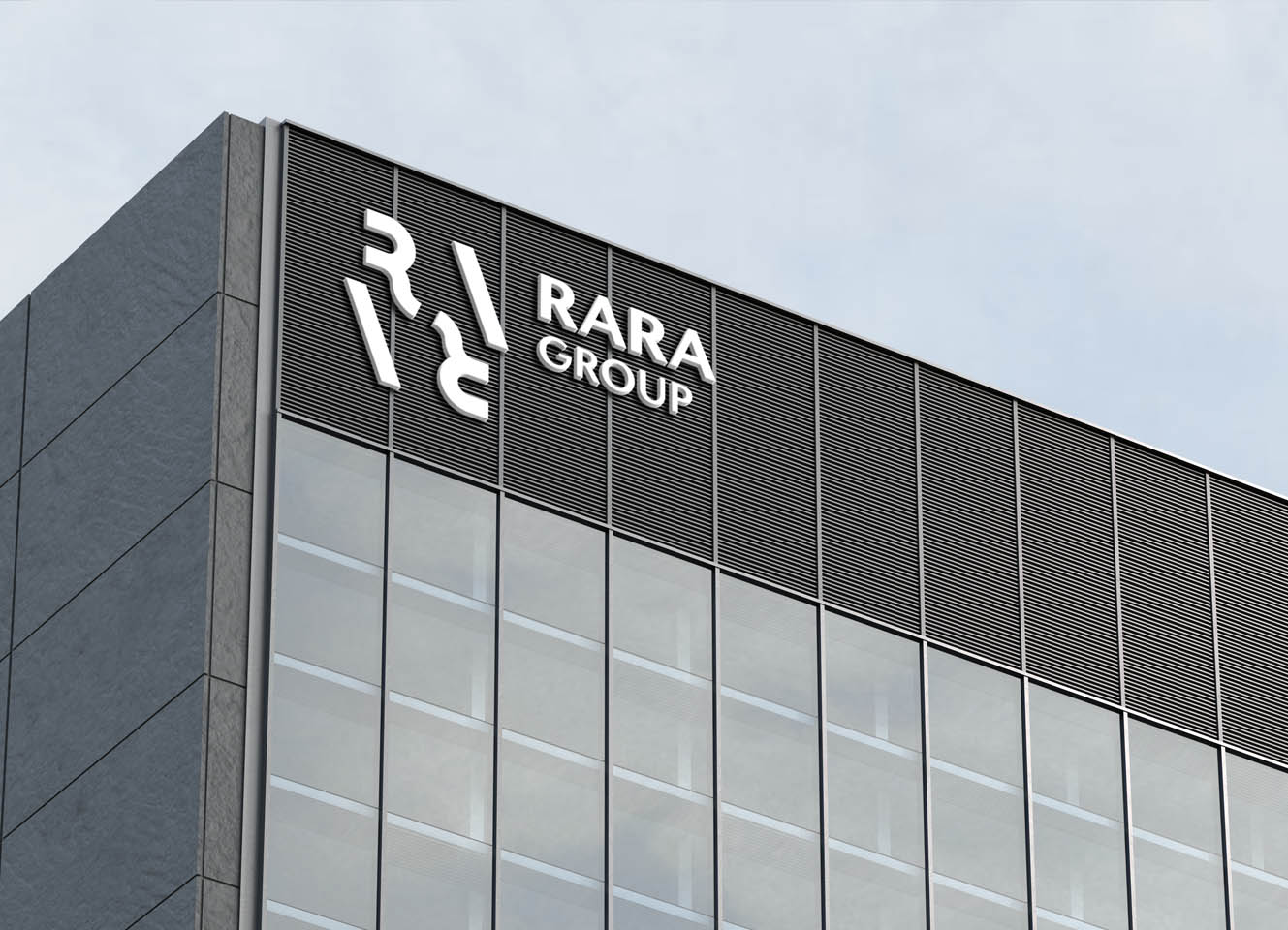
Understanding modern needs is essential. This is why, we worked with Rara on their rebranding, to make sure their values and high standards are translated to their visual approach as well. They offer a system of adapted and professional products and services. As a family business, they pave the way in the fields in which they operate, through the high standards present in everything they do. Rare Group means genuine and stable partnerships, they innovate in the sectors in which they are present, without deviating from the quality standards that have established the group.
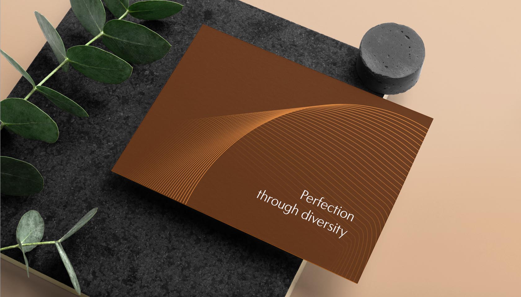
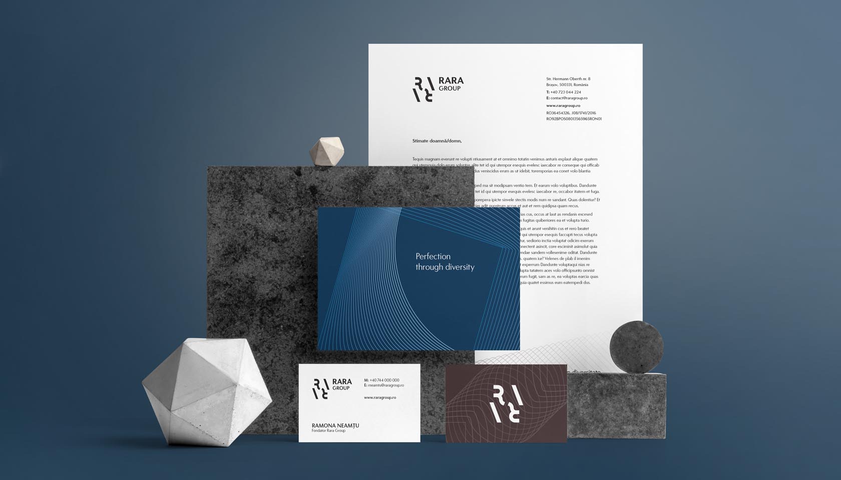
Motto // Perfection through diversity.
A group of companies is a little different from a single brand when it comes to visual identity. There is the mother company and brand with its subgroups and companies that also have other sub-divisions and brands. It can be a pain when nobody understands anymore how the core works.
This is when we come in the picture – figuring out the structure and every small detail so in the end, everything is transparent and aligned with the brand values. We followed the next steps in order to develop a stable and time-lasting visual.
We’ve created a well-documented research to find out about the companies history, past approaches, then we studied their competition and activity fields. Based on their values and goals, we managed to build their brand structure, archetype and assemble a well-structured brand brief with defined target audience, positioning, and many more.
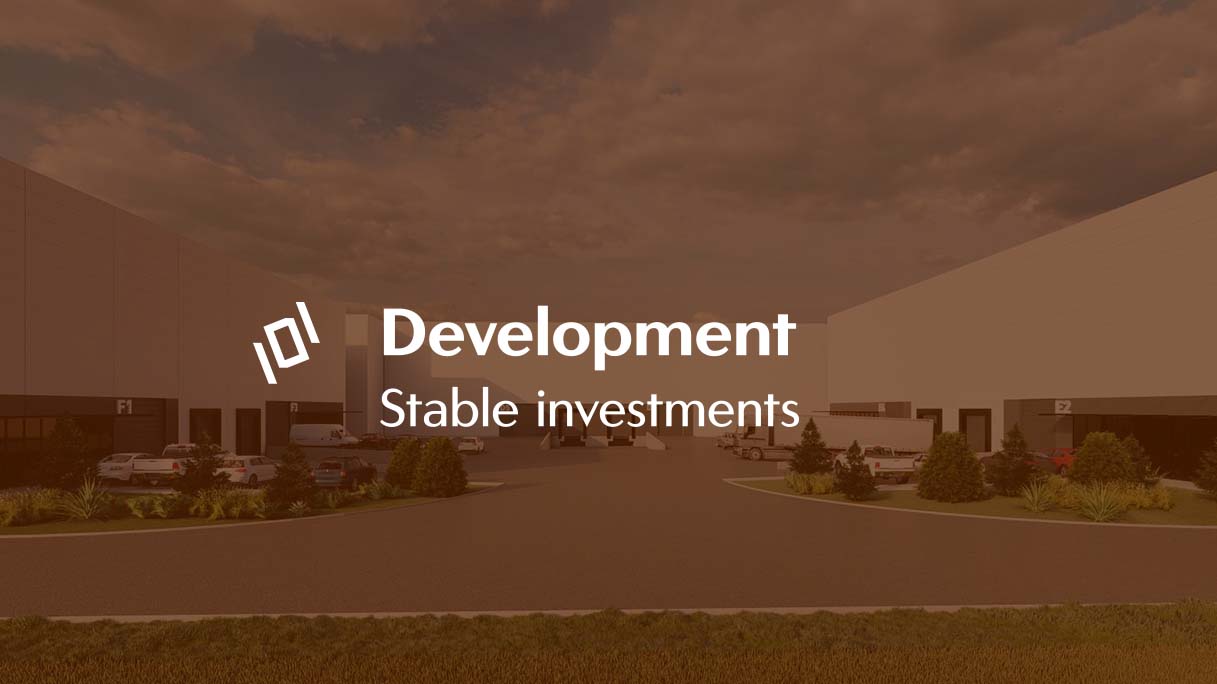
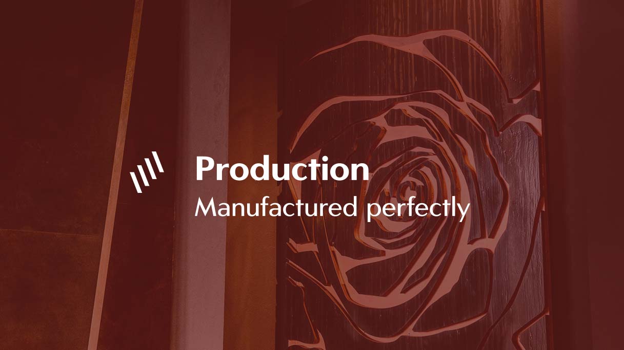
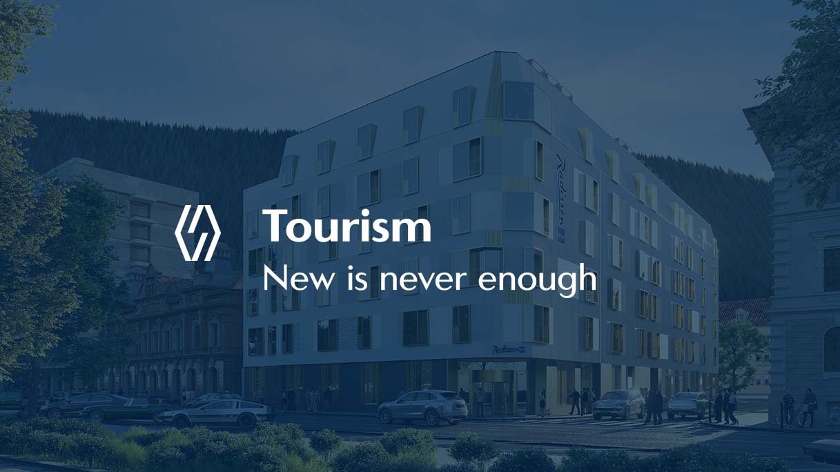
We divided their activity into 4 main categories, each having its own visual differentiators, characteristics, and brands, building everything on the House of Brands structure.
After all the research was done and we defined the core structure and strategy, we started exploring the verbal and visual necessities. We gathered examples of images, brands, colors, textures and fonts, keywords, etc. – that we presented in a style board to have an overall feeling of the brand. Meanwhile, the main verbal assets started taking shape too.
The main idea was to find an organized way to present their diversity in knowledge and activity fields, long tradition, and family business cores. The branding had to be minimalistic to balance its complex logistics.
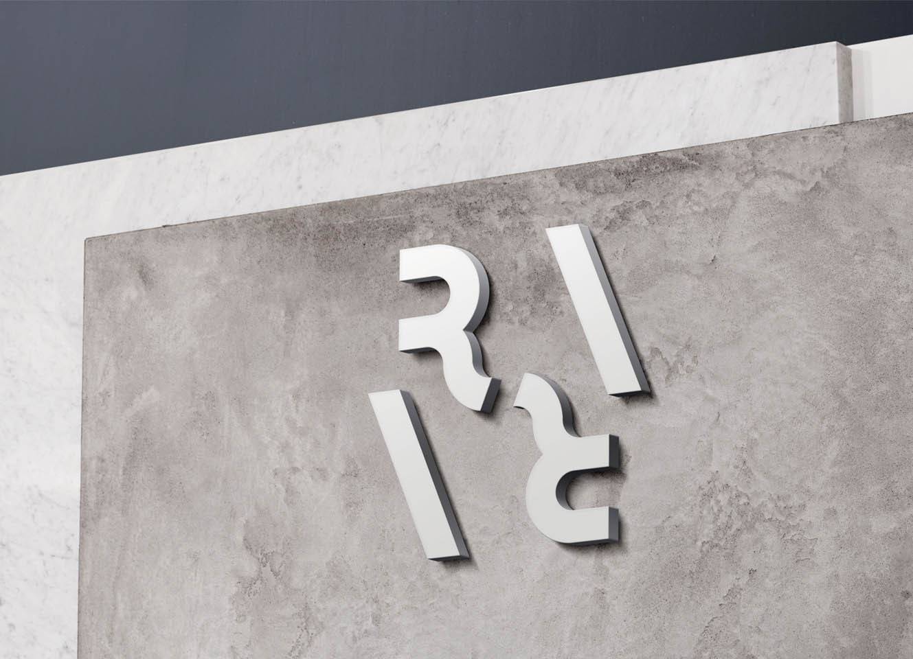
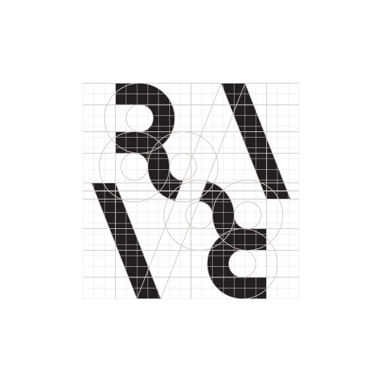
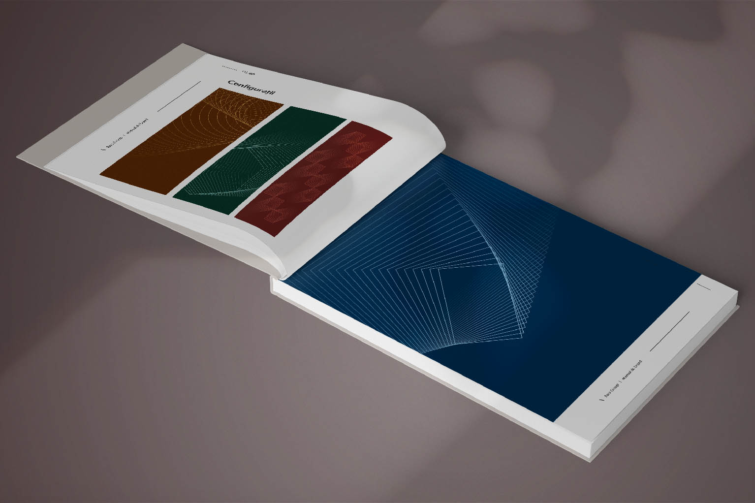
Not only in the logo but the 4 activity fields are also interconnected along the identity. Simplicity and data analysis/repetition are taken to another level – they communicate by morphing shapes and color metaphors to express connection and well-documented decisions.
From sketching and symbolism to a final logo, complementary elements, USP’s, objectives, brand essence, communication strategies to choosing a font family and color system; developing the website and promotional materials – and many more..
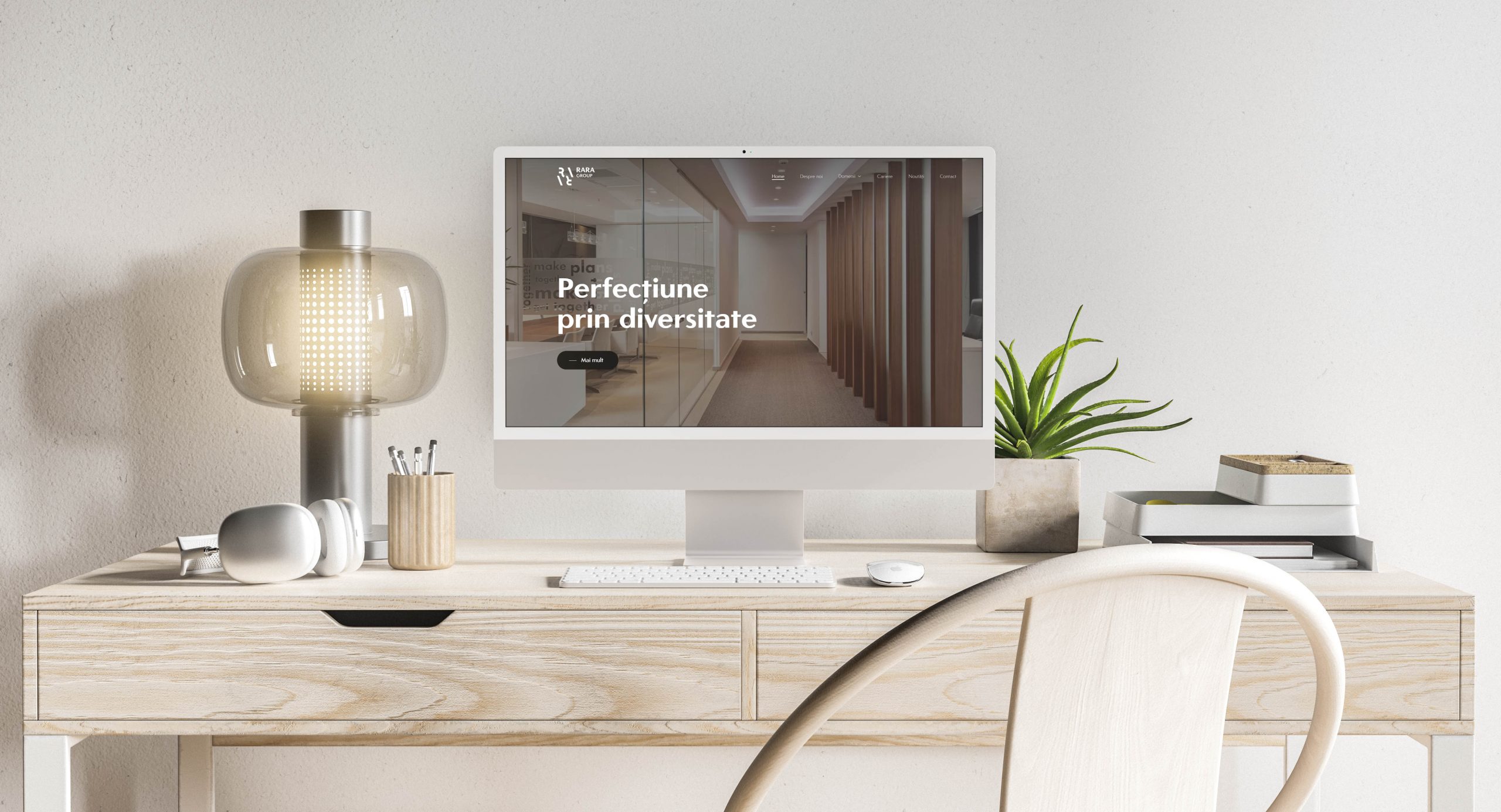
The website serves as an online presentation for the groups’ activities, goals, values and presents the structural construction of its personas. It is minimalist at first sight. Despite the simple style, it has a unique backend and lots of personalized features that allows it to present itself in a modern and simple way.
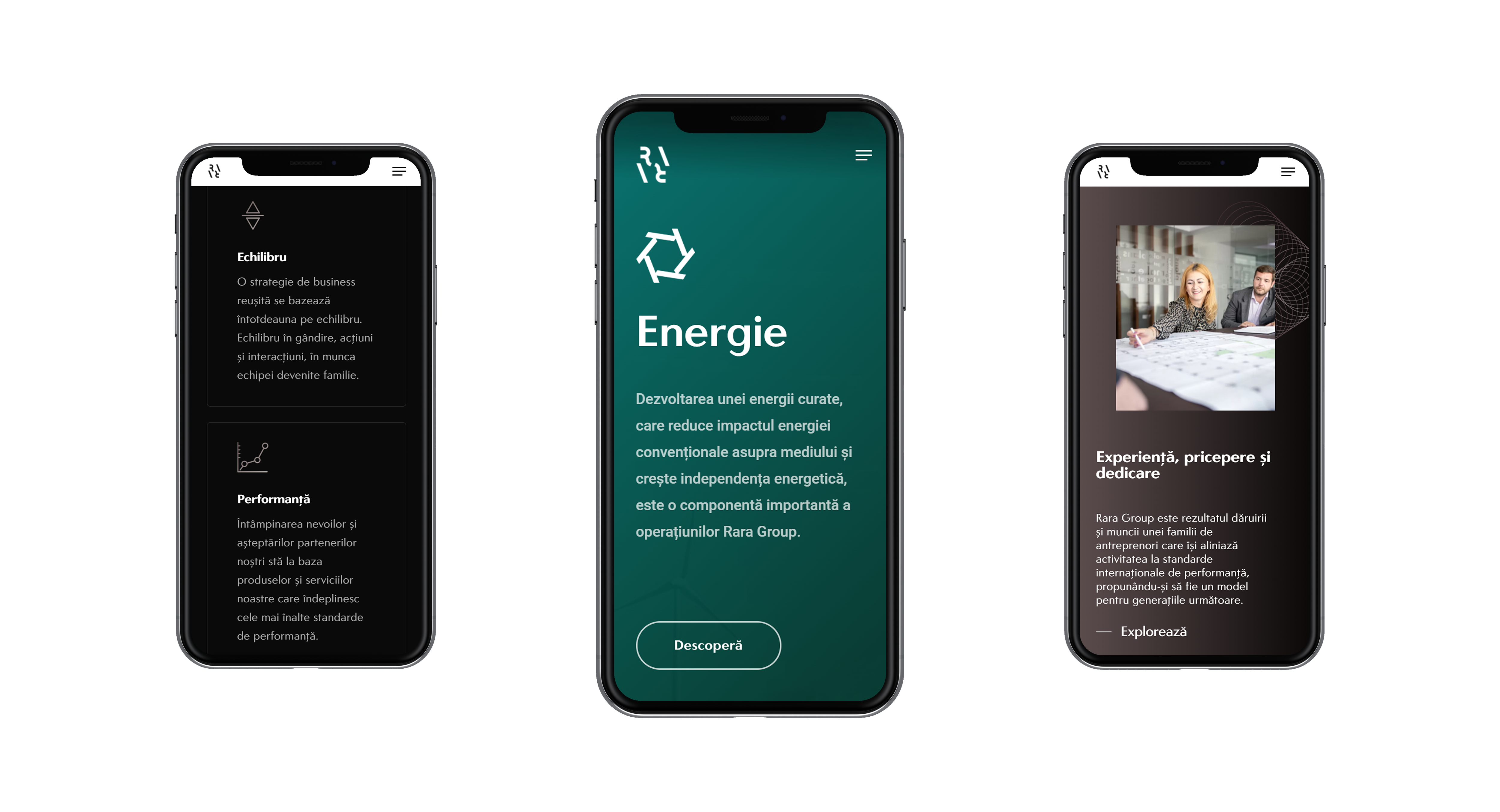
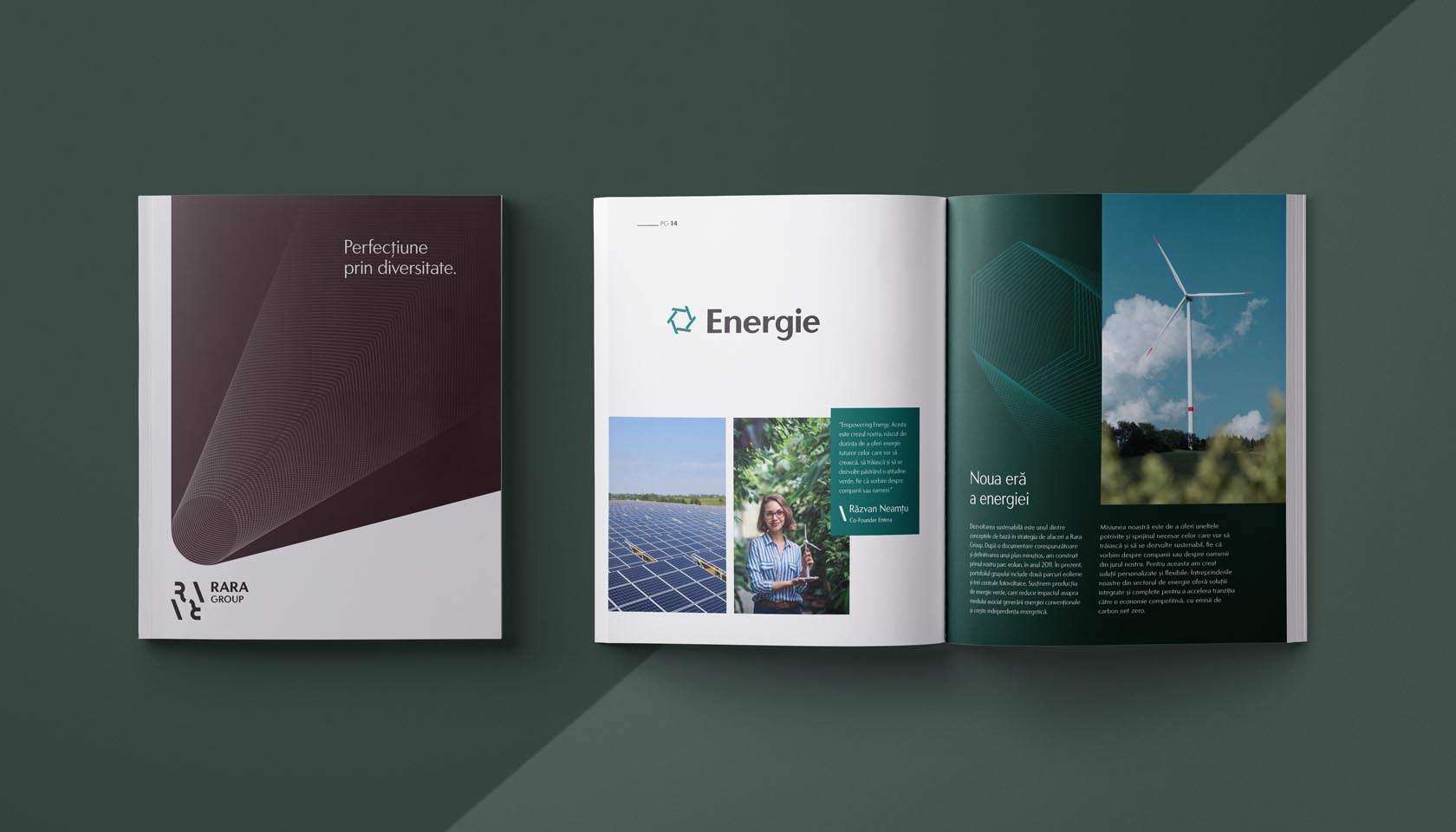
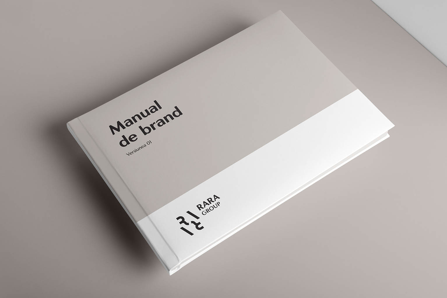
Over 80 pages, the Rara Brandbook includes everything for truly understanding the brand, its message, and its feeling – We’ve included rules that help in implementation, but there is plenty of room for creativity and further growth.
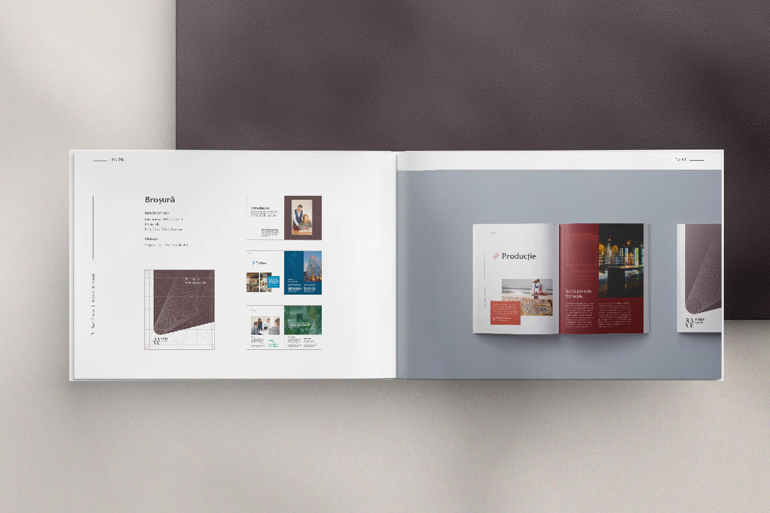
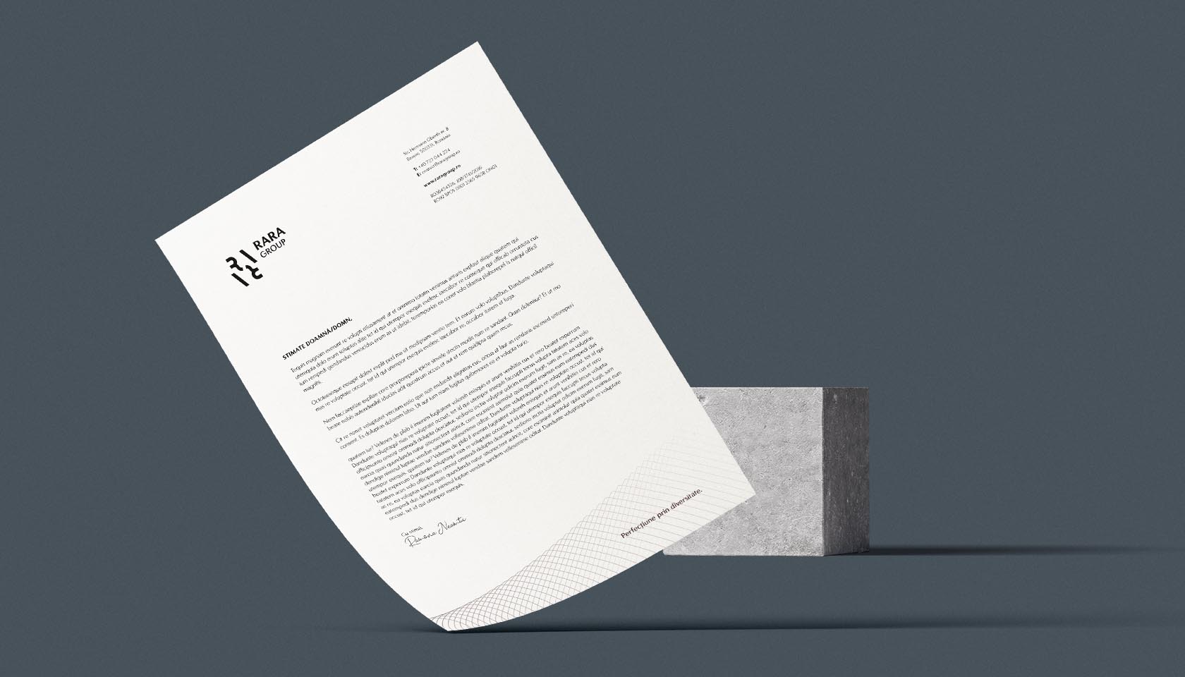
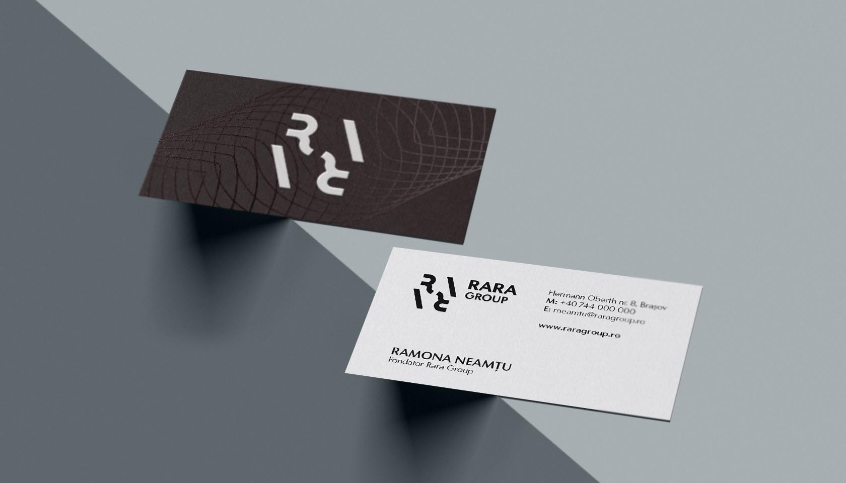
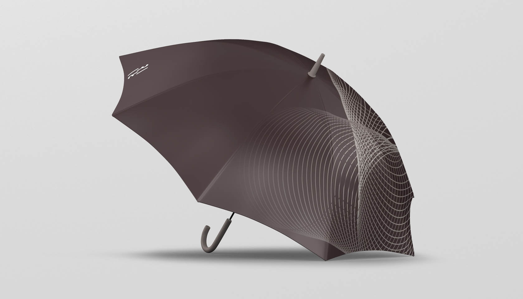
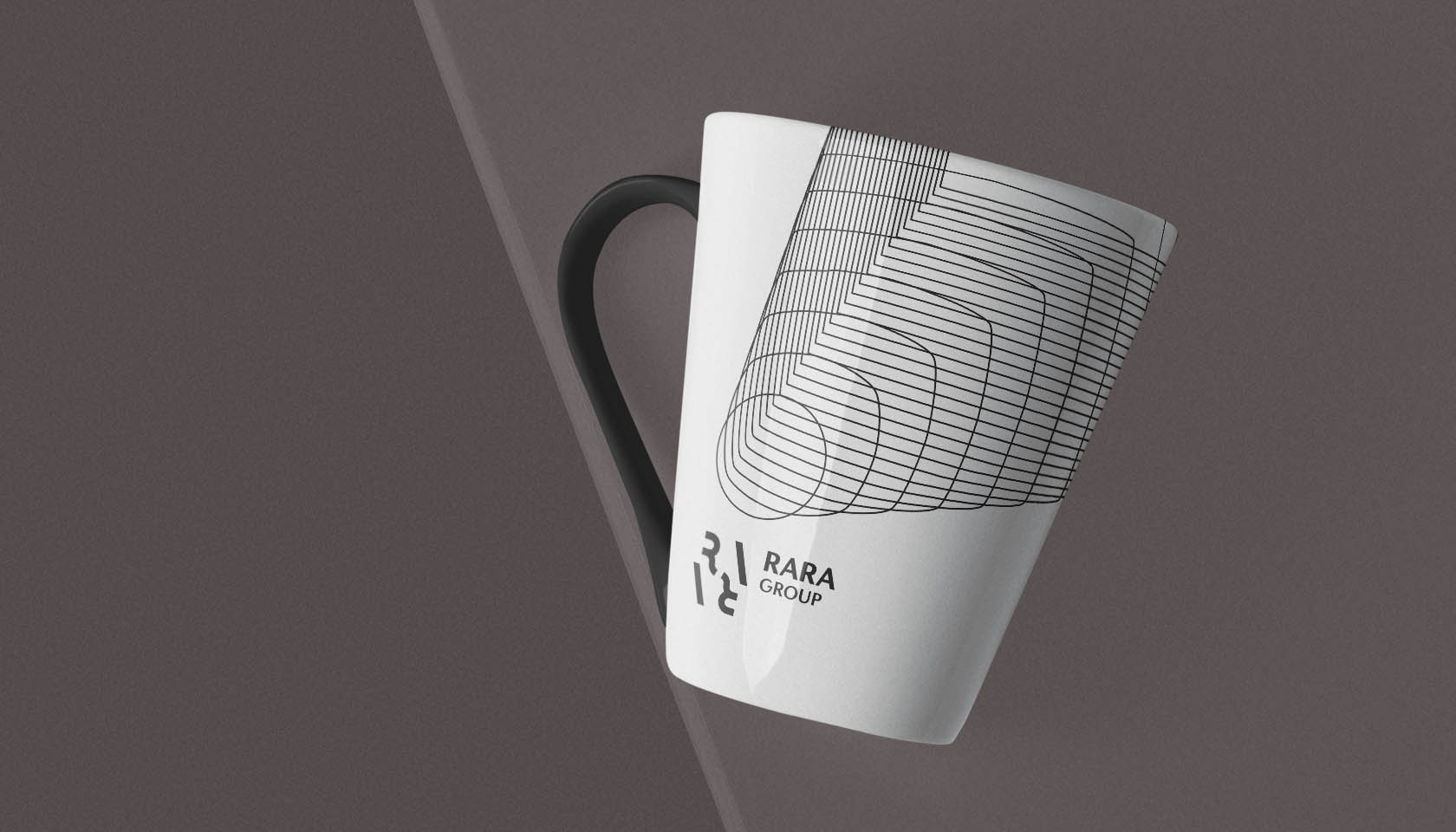
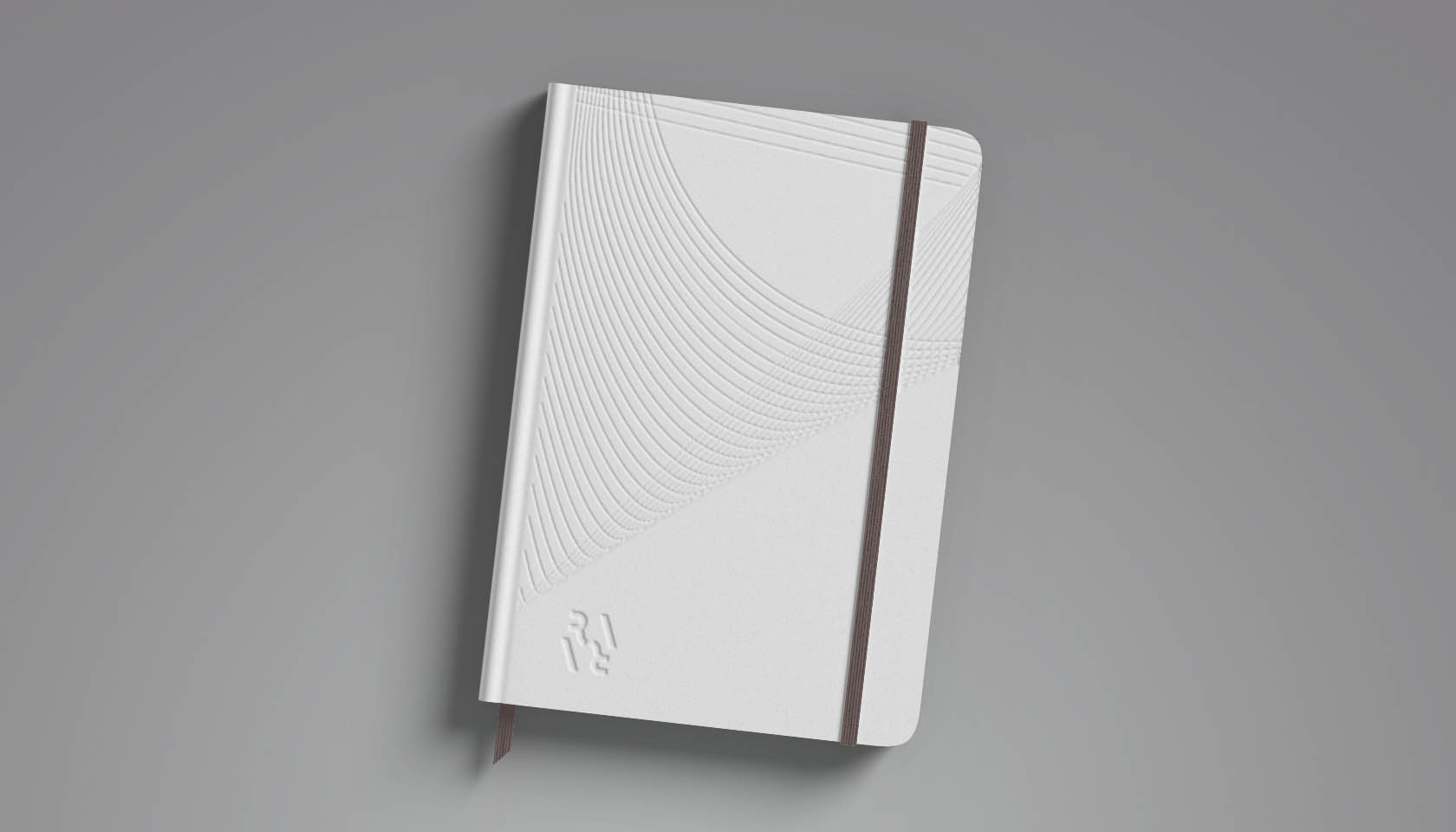
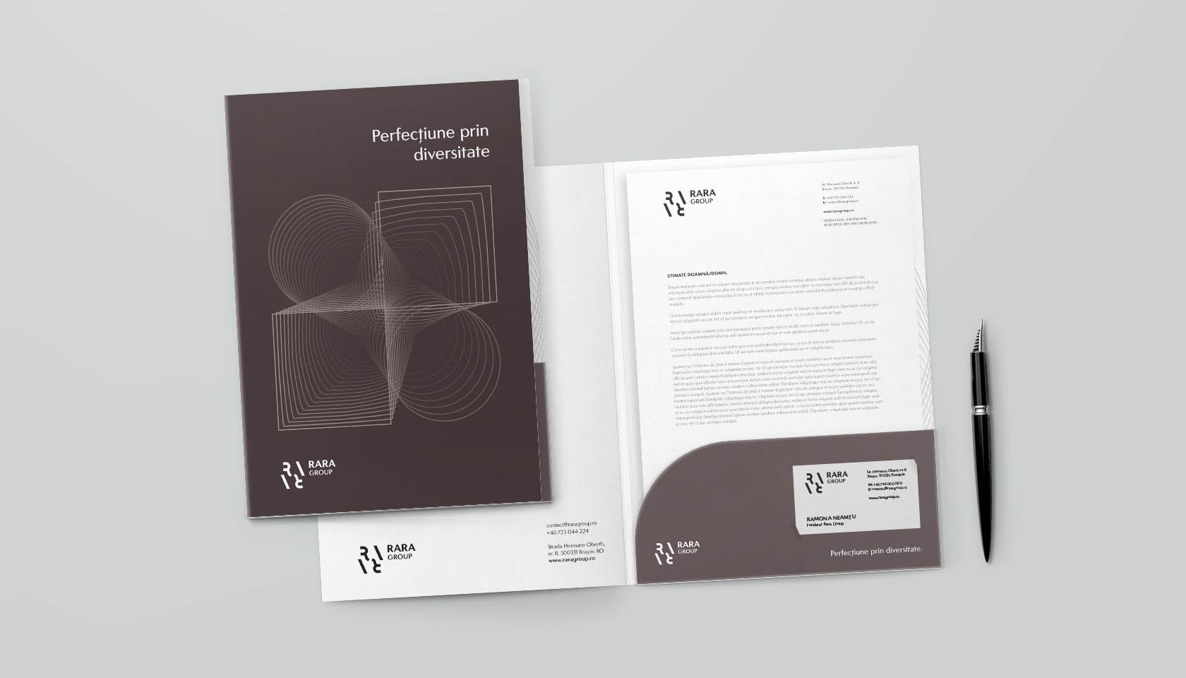
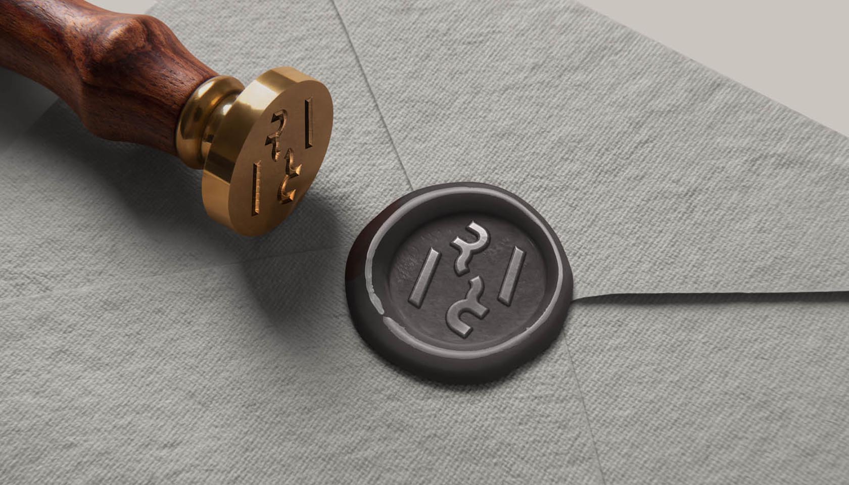
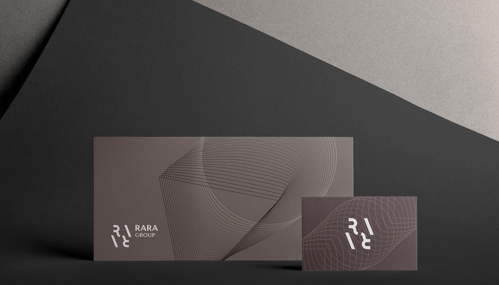
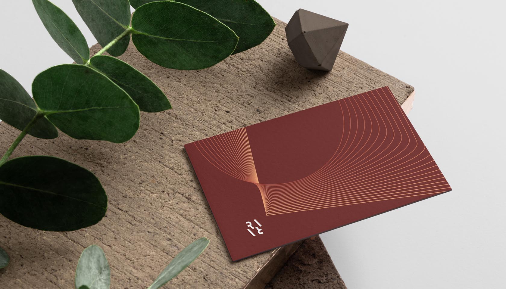
A group this size has a lot of stationery and other requirements when it comes to personalized items: brochures, flyers, business cards, mugs, notebooks, folders, letterhead, volumetric letters, umbrellas, mousepad – just to name a few.
It’s not the easiest to change when long years of hard work are behind you. People got used to your brand and it’s clear that you don’t want to let them down. At the same time, you feel you need to organize everything and be aligned with the modern requirements of the business world.
We’re here to put the pieces together.
